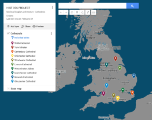
My experience with quantitative history, databases, and HGIS have been minimal. As historians, I think it is important to have some familiarity with tools such as ArcGIS and Excel, for example, because it does seem like it could be beneficial to some. Looking at the excel database set for British imports was very interesting. It was interesting to learn how to look for specific things within an excel spreadsheet consisting of 38,521 items. ArcGIS was also interesting; however, there were a lot of steps in the Lab that we did and multiple spreadsheets that I am not sure how I would use ArcGIS for my own research. Still, in the future, it might make more sense to me if it is related to a research topic I am doing. I find that Historical Geographic Information Systems can be incredibly useful in research projects, especially ones such as Google Earth and Google Maps. I am using Google’s “My Maps” for my initial research into my Final Research Project for this class to plot where the cathedrals I am researching are located and get geospatial awareness of my Research Project.
Throughout my university experience in history classes, I have focused more on primary and secondary sources of reading through books and journal articles. For most of my classes, I have not needed to make graphs or plot points on a map to support my thesis (until this year in both of Professor Clifford’s Fall and Winter classes). I have used databases such as JStor in all of my research papers and databases such as that I am familiar with. For HIST 397 last semester, I attempted to track crimes committed by women through excel with information such as who the defendant was, the crime committed, the verdict, and the penalty. I created some graphs, but I was not very confident in the information it told me and how it could help support my thesis, besides showing that most crimes committed by women were thefts. HGIS has been the most successful and exciting tool I have used so far.
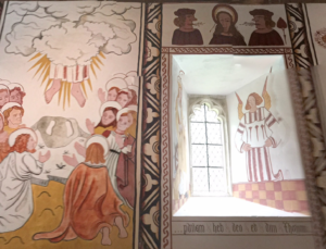
In the Fall of 2019, I took Art History 306 with Professor Wright, and for my research project, I was looking at portraits of St. Catherine. I had found a few portraits of St. Catherine recognizable by the wheel. One of the portraits I came across was a portrait of St. Catherine located in St. Teilo’s Church in Wales. I had no idea where this church was, so I went to Google Earth to learn more about the church itself.
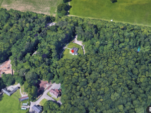
I found the church, and after “looking around” on street view, I discovered that I could go into the church! This aspect of looking for the church and going inside it did not help support my thesis for my paper as much as it gave me a better sense of where the portrait was located and what the people who went to St. Teilo’s in the 12th century would have seen. I could get a sense of the other portraits inside the church along with the one of St. Catherine.
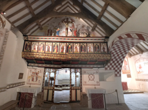
These are all images captured inside the Church of St. Teilo’s by Ewen Roberts. It is really amazing how much detail you can see without going into the church in person. This was very cool for me, especially because this assignment was for a university class, which meant I was obviously not going to travel to Wales to take pictures of the church, so having access to tools like this is incredible.
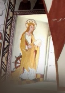
When just looking at secondary sources, for example, you might come across images of portraits such as I had done. But you do not get a sense of where the portrait is. I knew that it was located at St. Teilo’s, but where inside the church was it? It would have been tough to answer that question without going to the church itself. Luckily, I was able to find where it was, ponder the significance of its location in the window and ask who the neighbouring portrait was and if that had any significance.
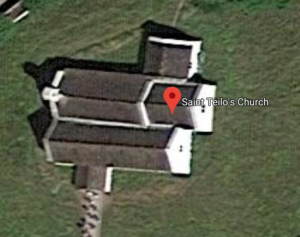
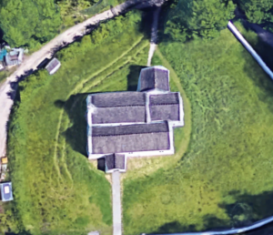
Lastly, the quality of HGIS software has evolved in the last few years, as can be seen with the two photos of the roofs of St. Teilo’s. The early image captured in 2019 is a bit more grainy and blurry, but the church is well defined, and you can see all the angles of the church. In the most recent version captured in 2022, the colours are a lot more vibrant. However, it looks more “cartoon” like. When up close, the trees do not look like trees, and the definition of the church is skewed. Digital history is always evolving, and there are ways to improve these tools, which can also be an evolving process as I do not think the newest version is entirely “better.” But it is important to recognize that these tools are becoming more useful, and so as historians, we should know to some basic level how they work, not just Google Earth but other digital tools as well because you might not know how useful they are until you know how to use them and start using them.