Blog #4 Hello Word

Learning how to program is like learning how to speak another language. It can be extremely frustrating at first, as one has to learn how to do even the most basic things like saying hello. Under the instructions of the Programming Historian, that is exactly what we learned to do first: saying hello.

Having finished a first-year introductory computer science class, many of the tasks and concepts were familiar to me, although these new concepts seemed to be presented in a cursory manner. Here is a pic of the explanation of a dictionary :

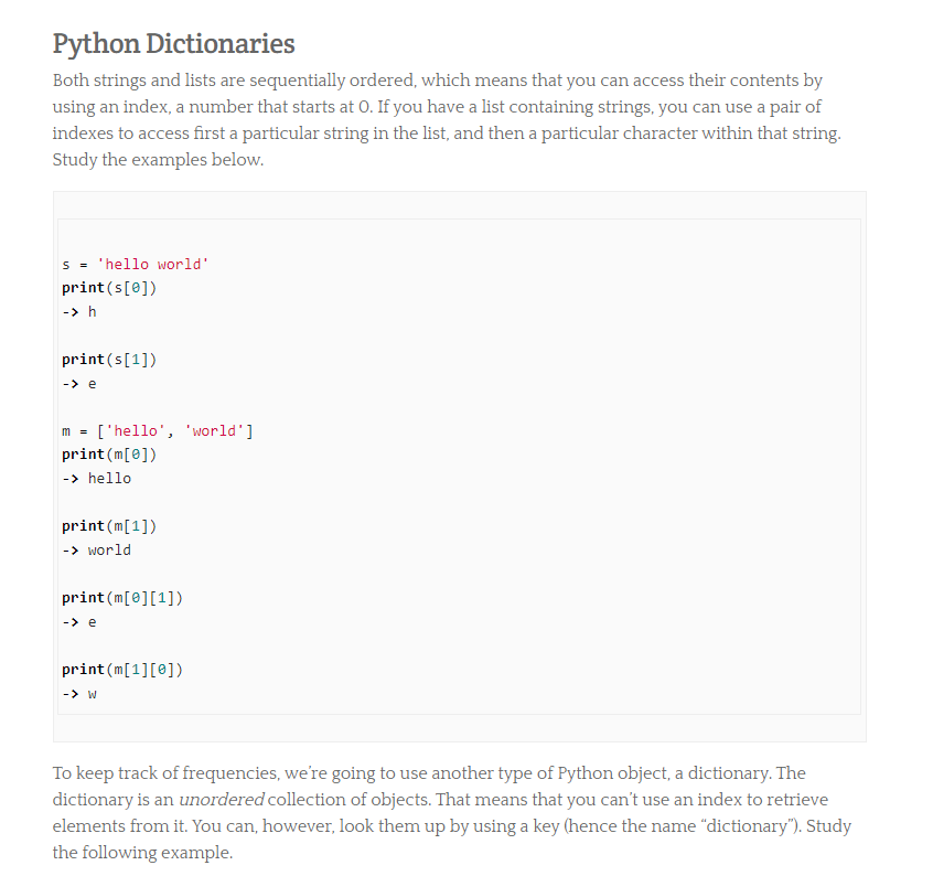
For reference, my introductory computer science class spent well over a week going over the concept of a dictionary and there still were students that struggled. Having a single page of explanation of what a dictionary is to history majors that think of the snake rather than the programming language when they hear “python” is insufficient and can turn people away from programming. I think many history majors will find the rapid pace of concepts being thrown at them overwhelming, especially for the more difficult (at least for students with no background in computer science) concepts.

While I understand the desire to be succinct, the overwhelming pace may do more harm by deterring potential programming historians away from coding. Just like learning a new language, especially at the beginning, there must be efforts made to ensure the user does not feel lost.

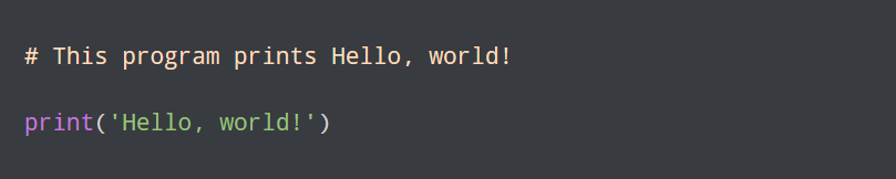
On a positive note, it was an excellent choice to present python as the first programming language for historians. Python has a clear and simple syntax, making the code somewhat readable even if one is not adept at programming. Look at this code to print “Hello world” from python:

Compare that to the code to print “Hello World” from C++ (another programming software):

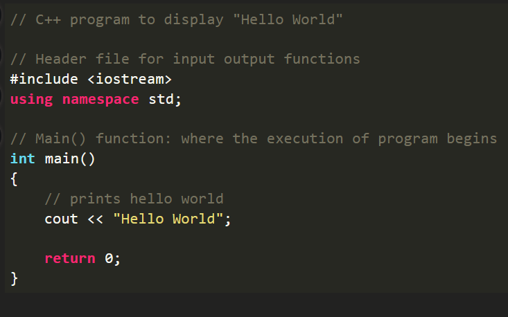
It is obvious which one is easier to read, and which one is also easier to initially learn.

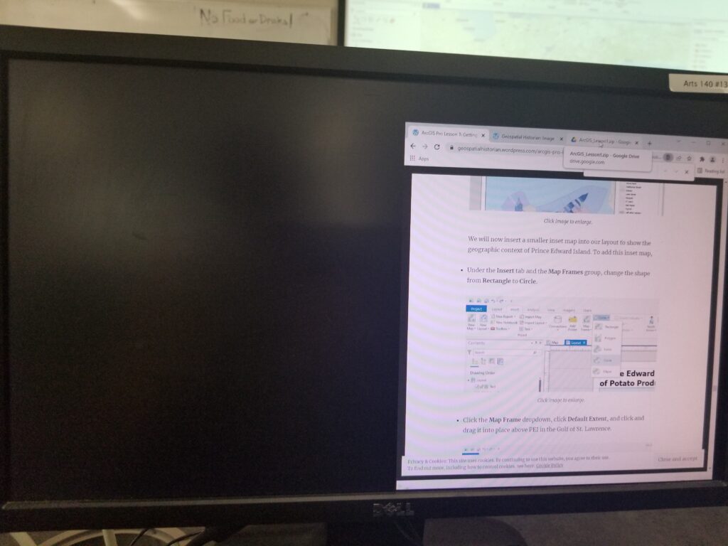
While I appreciate that the lesson provides information on the most relevant programming functions that historians will use such as how to download webpages and working with HTML, I think this also means that historians won’t be exposed to all the foundational knowledge. I don’t think this is necessarily a problem, as while in an ideal world a historian would be well versed in all the fundamental computer science knowledge, in the real world with finite time and deadlines, teaching a select number of applicable computer science skills is very efficient.

I think the lesson should further emphasize the importance of proper syntax: it probably is the most common source of error and frustration to beginner programmers. Having inputted a single wrong character or extra space can mess up the entire program, which seemed to be a common point of confusion among my classmates. I personally got a syntax error when I accidentally wrote “worldlist” instead of “wordlist”, which resulted in this error:

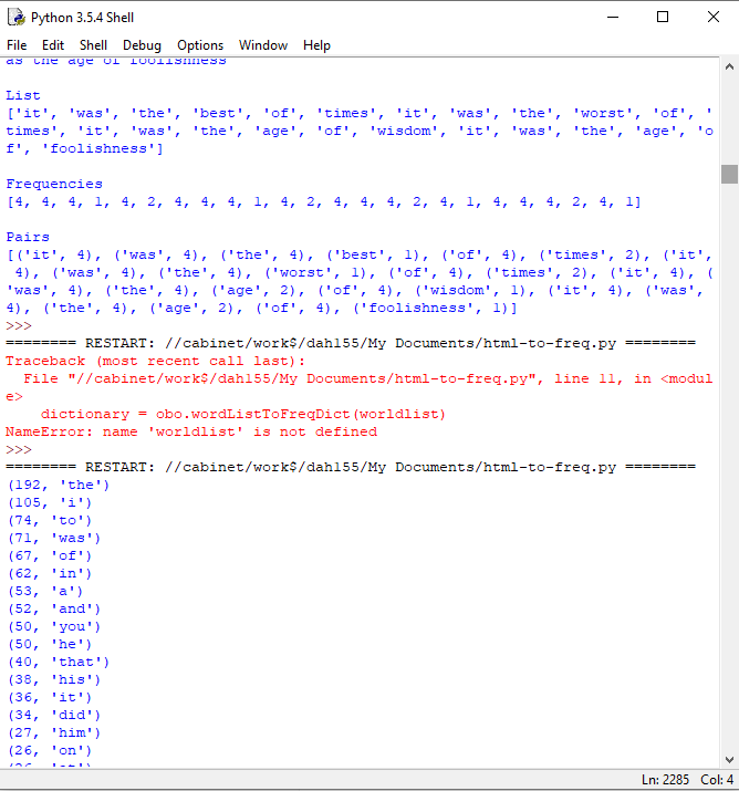
With the proper emphasis on syntax, many beginner programmers will be more diligent while writing their code, resulting in less errors and thus fewer hairs pulled out.

Lastly, while learning programming may be incredibly boring or confusing to many history majors, I think it is something that everyone must be exposed to. Even gathering the most basic knowledge of a function or a string can go a long way because these concepts won’t be completely foreign. Just like how even if one does not know advanced mathematics, one ought to be taught the basic addition, subtraction, division, etc… because at least having the basic knowledge will allow one to have at least somewhat functional conversations with other regarding that topic. Overall I thought the programming experience is necessary, even if it may not be everyone’s favorite. It may even have the additional benefit of making students be glad they chose a history major over a comp sci major, making them not regret taking history.

Blog #3: Quantifying History

Quantitative History

Let’s be honest. When History majors hear the words “quantifying” and “history” together, it results in a groan–many of us immediately think of numbers and data that can be extremely tedious and boring to look at. I confess, I was one of these people: the thought of looking at large numbers and analyzing them sounded as exciting as this (click it, it’s riveting). However, once I learned the powerful potential of quantitative historical analysis, the importance of this practice dawned on me.

I gravitated to The Revival of Quantification: Reflections on Old New Histories article by Ruggles because the topic of the history of historical studies is always fascinating to me. The notion that the new first wave of historians that were reformists believed there was no historical objectivity yet engaging in statistical analysis seemed at first glance, contradictory to me. Seeing that both the New Economic historians and New Politicians historians were objectivists, it seemed puzzling why the first new historians would be relativists.  Statistics initially seemed to be in the domain of objectivity, however, eventually I understood that if one examines the sample size, the people sampled, and the different methods of analysis that have their flaws, it becomes clear that the case for historical relativity seems more cogent.

Those that objected to “Quanto-History” such as Himmelfarb, disagreed on the basis that it was “bottom-up”, which is something I wanted to read more in the Ruggles article. I was curious as to why a historical approach that was “bottom-up” would be a negative thing, so I did more research on my own. I read Gertrude Himmelfarb’s The New History and the Old book, which describes old history as one that focused on constitutions, war, regimes, and revolutions. The new histories that rely on empirical evidence focuses on the common man and often alienates political history which is the realm of old history. The danger of alienating political history is that it allows the historian to impose their sense of reality onto the past while ignoring the politics that while are controlled by the ruling class, still affect everyone.

Himmelfarb also saliently brings up that quantitative history lacks in the field of morality, as one could use the statistical data to prove that slaves reveled in great economic conditions. Himmelfarb writes:

The critique of the economic analysis of slaves is not in its analysis, but rather the entire approach itself. As Himmelfarb states: “no amount of statistical ingenuity will suffice.” While Ruggles brings up the problems with quantohistory and the slavery example, I wish Ruggles expounded a bit more on Himmelfarb’s arguments; Himmelfarb’s case is presented in a manner that seems almost deficient in the article.

HGIS

Having previous experience working with QGIS in Dr. Hoy’s Mapping History class, I can summarize my experience in one sentence: magical when it works right, headache-inducing when it doesn’t work. The unfortunate problem is that for a student that possesses only entry-level knowledge of mapping software and a laptop that is barely more powerful than the newest phone, QGIS can lead to a lot of frustration.

My experience during the computer lab was definitely not ideal. In the middle of the lab, the software froze and did not respond to any input. When I opened the snipping tool on windows to take pictures of software, that also did not work as well. I had the absolute joy of working with a computer that had both software that refused to respond. Finally, the computer presented a black screen and that was the end of my lab.

However, despite my not-so-positive experience with mapping software, when it is utilized correctly, it can produce results such as Cunfer’s Scaling the Dust Bowl, an extremely effective and convincing historical analysis that would have not been possible without quantitative history and HGIS. The way it presents information in a systematic manner that is extremely thorough would be extremely difficult to show using other tools and methods of anaylsis. Quantitative history and HGIS are both things that are not perfect and have many flaws, but if utilized correctly, it can be extremely valuable.


Viewing The Met: The Future of Museums?

What is The Met?
The Met is an art museum established in 1866 by civic leaders, businessmen, and artists in New York. The Met spotlights all types of art: photographs, paintings, and live performances with instruments. Art from all across the world and different time periods are showcased, ranging from Islamic art to historical East Asian art. The Met has a website that allows the user to book exhibitions to their physical locations, but also allows one to get a taste of the different exhibitions and their conservation projects. The Met also presents virtual events that involve storytelling, live performances, film screenings, art-making programs, and conversations with Met creators.

The Virtual Audio and Video Tour

The website provides a trove of visual and audio content for the viewer to get a sneak peek into some of the works showcased in the museums. However, aside from the audio guides, many of the visual content serves to intrigue the viewer rather than to give the full artistic experience. You can take a virtual tour of the museum where one can only take a cursory glance at the art featured. I assume this is intentional: it intrigues the user and encourages them to visit the physical location. While the website provides pictures of their art collection that one can browse, many other photos that provide a highlight of the exhibition and what kind of art is going to be presented are spotlighted. The website has a blog as well, and it features deep reflections on a variety of topics ranging from arts from the Civil Rights era to how art was safeguarded in World War II. These blogs are an interesting dive into a specific area of art, and they find ways to tie in either the history of The Met or the art showcased in it. It makes The Met feel like it has a significant role in the history of art.

The virtual 360 is definitely a cool experience, as the viewer can feel extremely immersed and is also given the freedom to look around wherever they please.

Is This the Future of Museums?

The Met does an extremely good job of incorporating digital technology to not only make art more accessible but intriguing as well. What I was most delighted by was that the website doesn’t deter you from visiting the physical location– rather it incentives visitation by drawing you in. Oftentimes if the museum presents too much of the featured objects online, viewers may have no reason to visit the physical location itself. The focus of the website is to present the highlights of the exhibition rather than displaying the entire collection (which can be accessed if the user chooses to do so.) It focuses on the experience the user can have if they visit. The website is clean, modern, and works extremely smoothly. Using the website to see photos of the featured art and glimpses of what I could possibly see if I were to visit the museum was a positive experience as a viewer. I think if other museums had the funding, this is the right step forward for museums: to spark curiosity by providing hints of what can be experienced if the user were to visit the location in-person.

Blog #1 Quantifying Kissinger

“Everything on Paper Will Be Used Against Me:” Quantifying Kissinger is a textual analysis project by Micki Kaufman, a digital historian that focuses on large-scale projects involving data analysis and visualization. The project tackles a new problem modern historians face: the overwhelming quantity of data that complicates forming historical interpretations. Kaufman’s project handles this problem by using computational textual analysis to form visualizations of approximately 17500 meeting memoranda and teleconference transcripts that have been released by the Digital National Security Achieve.

The documents belong to Henry Kissinger, a man who served as the United States Secretary of State and as the National Security Advisor, where he influenced American foreign policy regarding China, the Soviet Union, Vietnam, and the Middle East under Nixon and Ford.

Text Analysis Methods

All the document’s metadata were converted into a table that was organized and analyzed by OCR. The OCR resulted in approximately a 6% margin of error. The website notes that if the OCR process incorrectly recognizes a word as another correctly spelled word (e.g. sea/see) it would be not counted as an error. This means that the possible number of errors could be higher than the initial 6% figure. I am concerned about the accuracy and the viability of the data when the error rate is likely higher than 6%; even Kaufman is unsure of how much greater the error rate could potentially be.

The data organized was used to form a visual network of words that were closely related to each other. For instance, the word “bombing” was a frequent word in the teleconference transcripts, and it also happened to be well connected with words relating to “Vietnam”. While the connection between “bombing” and “Vietnam” is quite obvious to any person with even a cursory interest in Cold War history, I can see how the networks between frequent words could be useful to find potential connections in history that historians have never considered before—especially when historians are met with a deluge of information.

The visual network of words is interactive, and while it is something that sounds neat, due to the cluttered layout of the visualization it is difficult to clearly see the connections between the desired words. The problem is that while the viewer can highlight a network, the viewer is still able to see all the other networks, leading to a visual mess that can be headache inducing when trying to look at a specific network.

The Value of the Project

The project offers new insight into tackling historical big data in innovative ways. By analyzing the language of Kissenger, Kaufman engages in “sentiment analysis” that displays Kissenger engaging in more past tense language rather than future tense language despite his reputations as a “forward-thinking master”. While I still have concerns about the error rate regarding OCR, new analysis like this would have been unthinkable if humans had to manually peruse through 17500 documents. Even if the new analysis may not be perfect, it sparkes new questions and possible connections that would have been missed before, therefore I think this project is valuable.

Representation

The Quantifying Kissinger Project was created by Micki Kaufman, a woman in digital history. This project does not make much mention of representation because the salient purpose of the project is to focus on a single historical figure: Henry Kissenger.

Final Thoughts

The ability for a project to draw connections from 17500 documents is something that is impressive. While this project brings new questions and angles of analysis to a large number of documents, it does not explain the significance of the connections: it merely points them out. It is up to the historian to draw the significance between connections. This project demonstrates the benefit of computer analysis: expediting the more tedious work to leave historians with more time to think about the significance of the connections. While Kaufman could have done a better job of accounting for the errors in the analysis, the sheer magnitude and ambition of this project merit an examination of this project to anyone that is interested in Kissenger or the Cold War.