A Review of The MERCES Project
The MERCES Project: What is it?
“The MERCES (Marine Ecosystem Restoration in Changing European Seas) Project” is an online museum exhibit which showcases the current degraded state of European marine and costal ecosystems in hopes to bring awareness to the issue. Found here using a story map format provided by esri, The MERCES Project aims to help progress the transition to a more sustainable future in order to restore the many marine ecosystems that are currently suffering. The site offers information on the current problem at hand, as well as solutions and how such solutions will impact the survival of our world.
My First Reactions
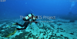
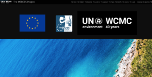
I’m really not going to lie, I hated viewing this site. I was first pulled in immediately by the content – as someone who really enjoys being alive, I tend to care quite a lot about our ecosystems that are currently in danger. Unfortunately, the site itself let me down in the worst way, almost making me choose a different exhibit to look at that was much more pleasing. My main issue with the site is that there is just enough not going on that it makes my brain hurt. The title page was very promising – a pleasing photo with adequate font overlaid on top, easy enough to read and understand what you’re about to get into. Clicking the downwards facing arrow takes the viewer to a mostly black screen featuring the UN and MERCES logos. This is what first stopped me in my tracks. Is this the end of the first page? After a quick glance at the scroll bar, it is in fact not and I have to continue scrolling. This huge black bar is so aesthetically displeasing and seems so out of place.
The Scrolling
My most nit-picky negative opinion on this website is the layout in general. I personally think that sites that incorporate the scrolling photo-and-information change are really cool! The changing images catch the attention of the viewer just long enough that they also read the text on screen before they scroll once more. However the incorporation of it on this site was not done well. In fact it is so bad that I decided to make a whole section dedicated to it! I quickly regretted not choosing a different exhibit after having to scroll up and down this site a few times to figure out what it was all about. This might just be me, but if I feel like I’m going to get carpal tunnel syndrome from scrolling down a website, something isn’t quite right.
Aesthetics: Too Much Vs. Too Little
Another rather large issue on all of the sections of this website is that there is just way too much empty space in between both headings and regular text boxes. The first section that actually gets into the project itself is a perfect example of this issue. Clicking on “The Vision” Tab on the menu of the page brings forward this image:
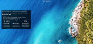
Now this doesn’t look awful! The problem lies again in the scrolling. A viewer may see this image and ask if there is more to this vision and begin to scroll, which they are then met with a heading titled “The Problem” with no immediate text appearing.
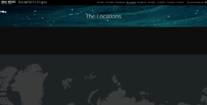
Another perfect example is the section under “Locations” in the menu bar. Clicking on the section takes you to an unappealing page with absolutely no information immediately present. The misuse of this space creates an increasing hostile interaction between the viewer and the site, which in turn negatively affects the viewership of the project as more and more individuals click off before reaching the bottom.
Is There Anything Good About This?
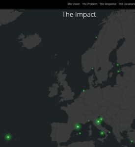
You might be thinking at this point, “Well Kiersten, aren’t you being a bit of a pessimist? There has to be something alright with this exhibit!” and to that I would say of course! There is always a flip side to every coin. One of the aspects that I enjoy on this site is the use of the map background and how it changes with the information that is being presented as the viewer scrolls. Despite the many issues I have with the formatting of this site, I do believe that it is useful to be able to see where exactly they are pulling their information from.
Included in this, despite my pessimistic views towards the scrolling and format of the page, it is relatively pretty to look at. The images used are very pretty and do not take away from the information provided. I also enjoy the inclusion of accreditation at the bottom of the site. There, they give credit to the individuals that all worked on the project as well as provide links for further investigation on the topic that they did not provide. This is very beneficial to researchers and students alike. Overall this site provides readers with very interesting and powerful information in a relatively useful manner, with my only complaints directed towards the user-friendliness of the formatting itself.