
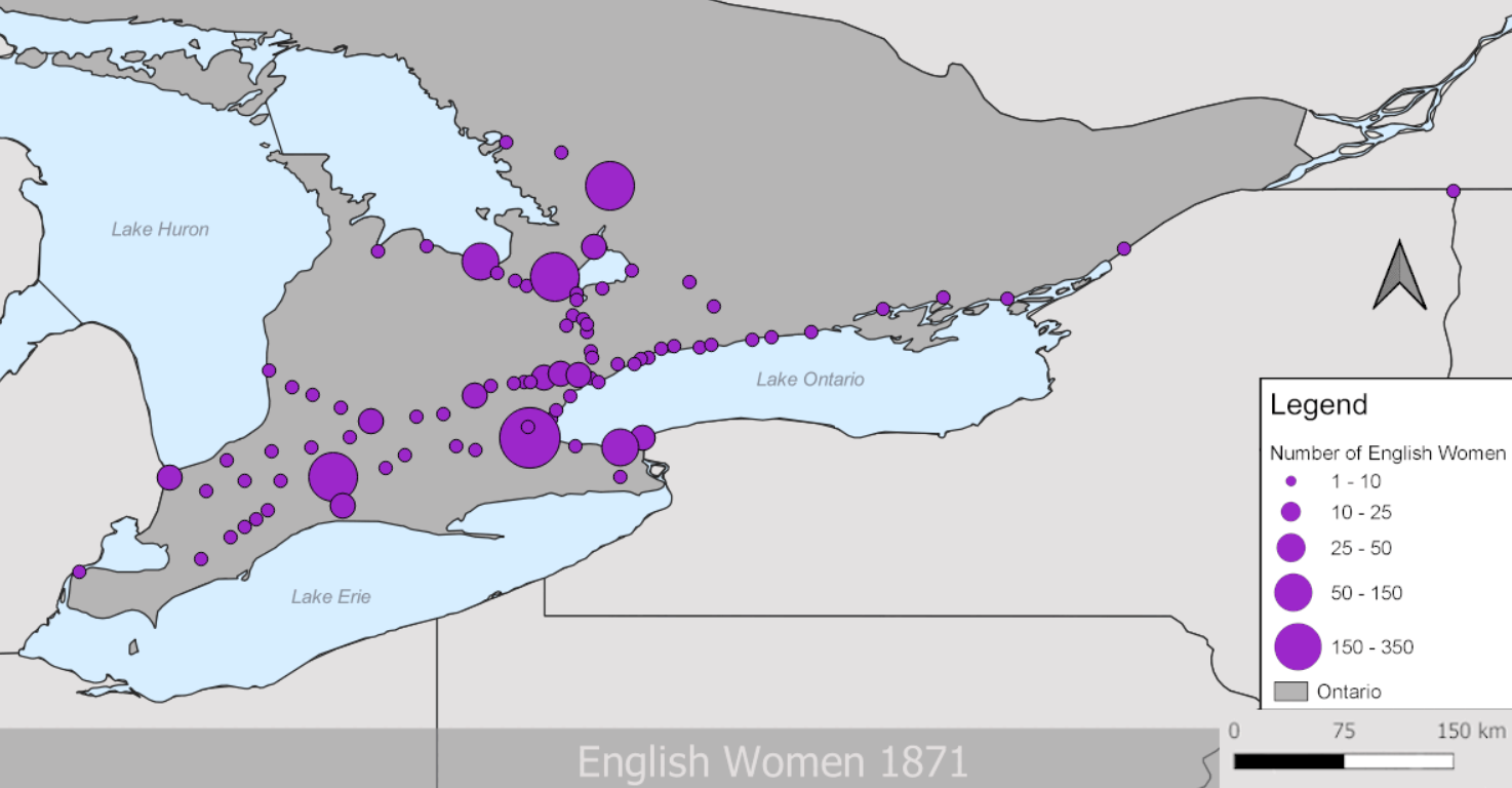
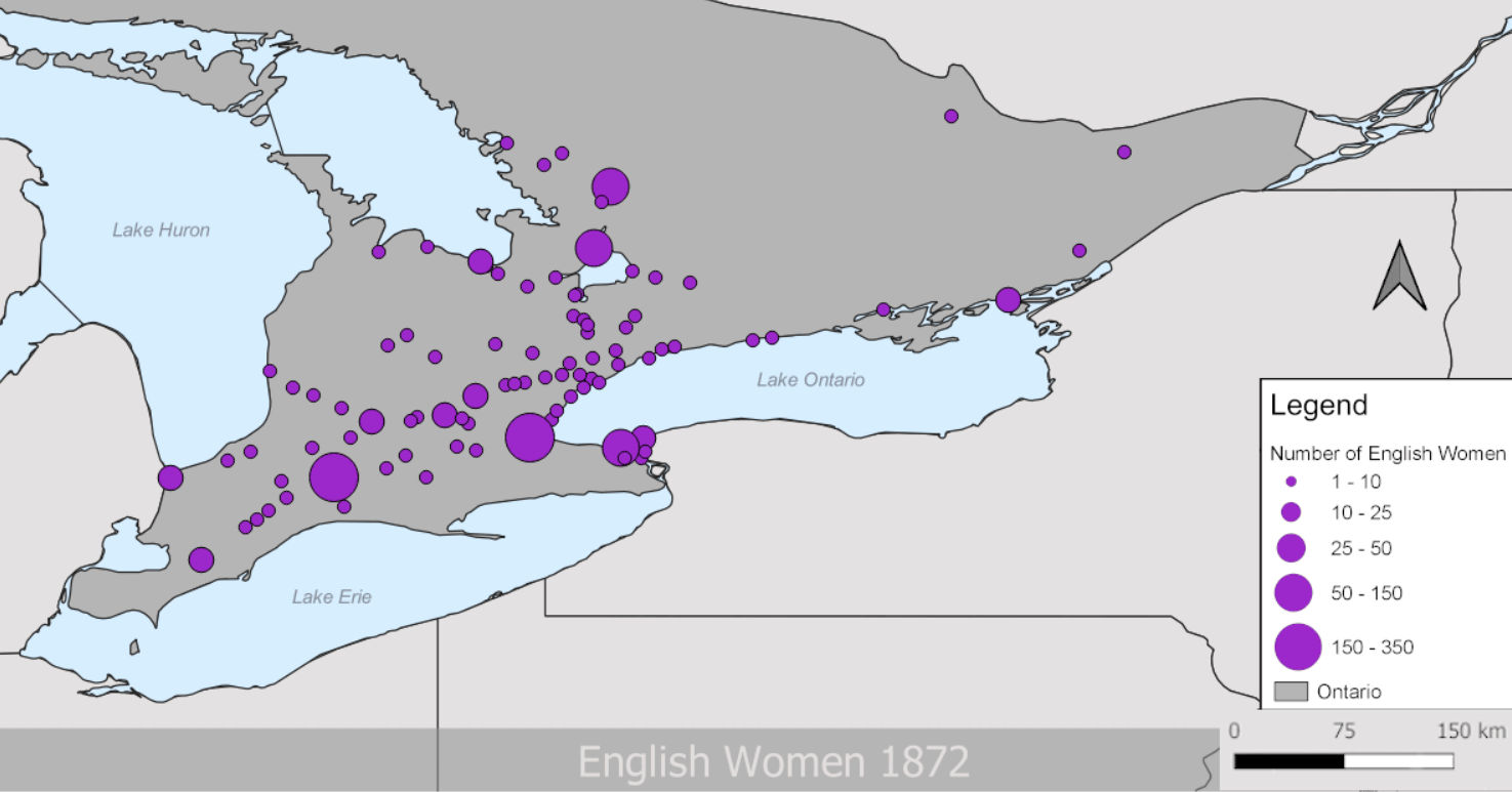
In my experience with quantitative data, I found it most useful as a way to observe broad trends across a large group of people, specifically how many Irish and English women immigrated to Ontario between 1860-1886. My project from last term aimed to map these women’s final destinations within Ontario and answer the question, “Why did they chose to emigrate?”
Quick tip: Emigration is Exiting, Immigration is Incoming. These women would have emigrated from Ireland or England, and immigrated to Ontario, Canada.
That project allowed me to experience both quantitative data analysis and HGIS software for the first time in my undergrad. If you had told me I would be looking at a spreadsheet full of numbers and coordinates in a history class, I don’t know if I would have been thrilled. I’m good at reading and writing, not numbers. There’s more forgiveness in interpreting something you read with your own eyes as opposed to telling a computer system exactly how to read a source, right?
That’s what I used to think, but there’s risks in interpreting any source. We might feel comfortable reading a source with our own eyes, but as discussed in class, individual sources are often de-contextualized. Turns out quantitative data is just a slightly different skill set to learn.
I experienced first-hand some of the risks involved with interpreting quantitative data specifically, and I can understand why there may be hesitancy to step out of our comfort zone to include these methods in our research.
Let’s take a look at the challenges I encountered.
Ctrl + S Really Means “Save My Sanity”
If you want a tip on working with a GIS, please save often and minimize the number of programs you have running in the background. I worked with QGIS for this immigration project, which is a nice and free GIS program. The only time I’ve used ArcGIS was in our last Lab and I succeeded in getting exactly two screenshots of my progress. One was a Black Screen of Death. I don’t think I can truly compare Arc with QGIS at this time, given my minimal experience with Arc. That being said, both can and will crash, freeze, and delete everything you know and love. Ctrl + S often.
I Had 99 Problems and Excel Was All of Them.
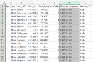
There is a decently steep learning curve when it comes to trouble-shooting QGIS issues. If you don’t get your data inputted right, if your dating convention uses March 12, 1884 instead of 12/03/1884, and you don’t have a broad vocabulary to plug into Google, it can be overwhelming. I ran into multiple issues from the start.
My project looked at English and Irish women specifically, but the dataset I had included men, women, and children from all over Europe. My first challenge was learning how to separate the demographics I wanted from everything else.
After I thought I had done that, turns out I hadn’t. There were still points showing up on my map for the men and children from Ireland and England.
Symbology Matters
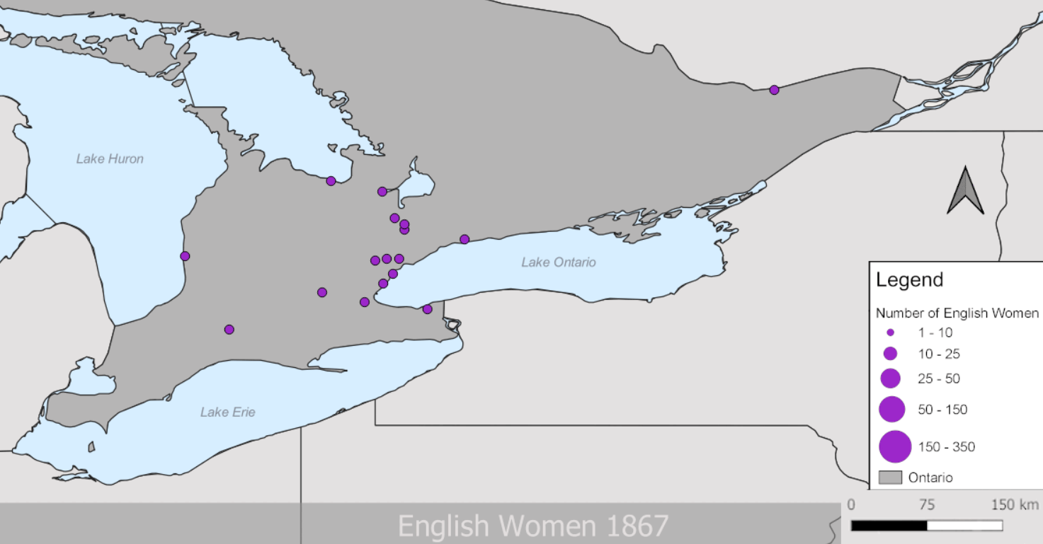
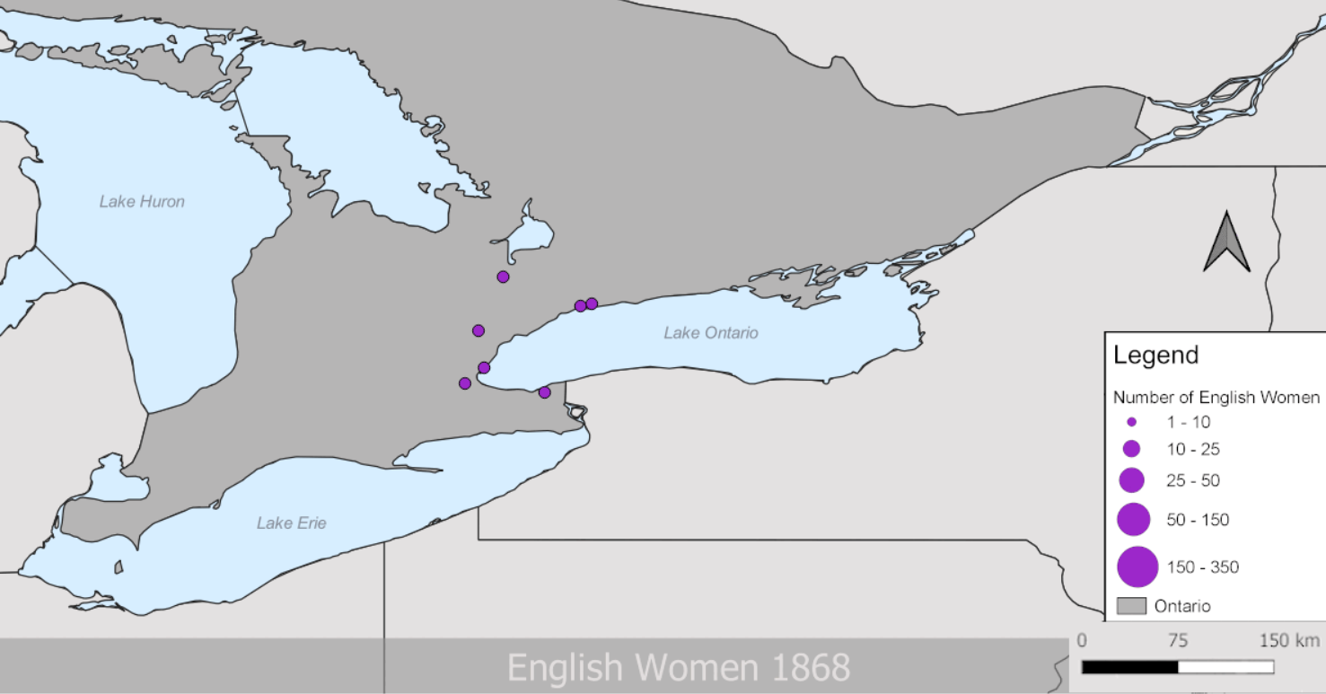
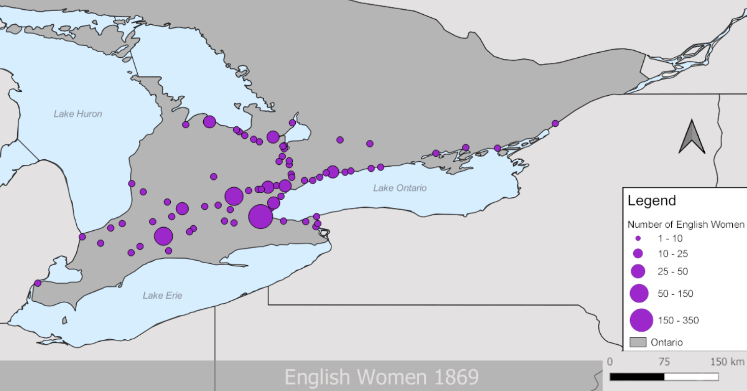
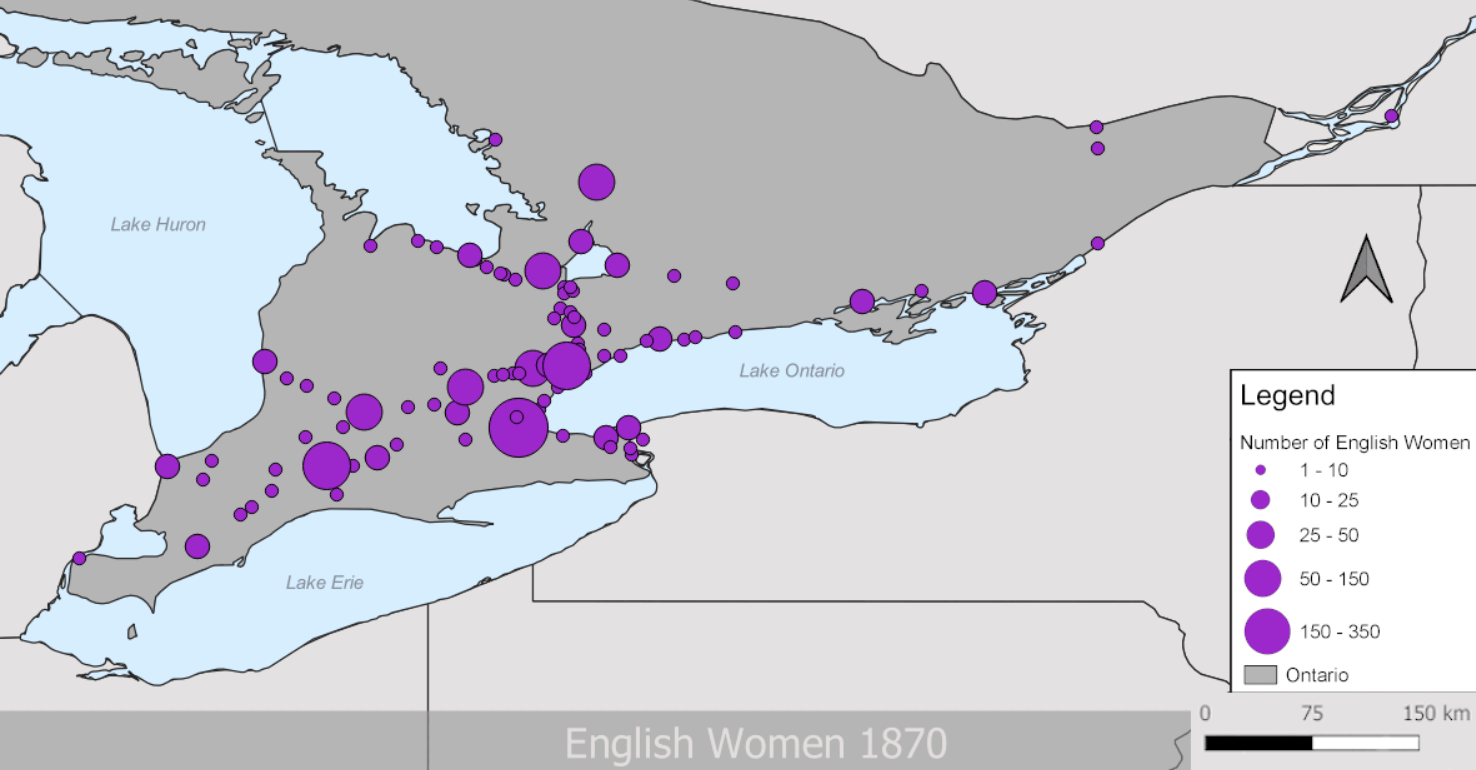
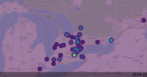
Once I had just English and Irish women appropriately separated, there was the issue of how to represent the data on my map. You want to choose symbology that pairs well with your data. I initially thought a heatmap would do nicely, but heatmaps are only good when there are no gaps between your points. My points had large gaps between them, as you’ll see below.
It was suggested that I try a graduated symbology, which means the more of a Thing there is in a Place, the bigger the symbol gets. That was more intuitive for a viewer, but making it work properly had its own challenges.
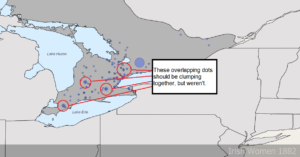
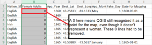
QGIS wasn’t lumping all the women of a location together on the map, there was just a pile of overlapping circles that weren’t getting bigger. The issue turned out to be the fact that QGIS was lumping women together based on their date of arrival. If there were eight women in the spreadsheet that arrived in Toronto on June 13, 1870, they’d be lumped together. If there were five more women that arrived the next day in the same place, they’d be a different lump. This might have worked if I wanted to compare each individual day, but I needed to simplify things to just represent the total number of women in a year. The solution was changing the Day and Month fields to January 1 across the board. What was left was just unique Years and QGIS could now lump the way I wanted it to.

Was It Worth It?
Yes, there were challenges, but I think that quantitative methods and digital tools belong in history. I had a lot of fun challenging myself to make my maps and properly understand the data I was putting in them. I learned that I am capable of understanding numbers (despite my Arts & Crafts Degree).
Once I was able to properly input my data and see it on a map, the visualizations brought up questions that reading through an immigration log book wouldn’t have. (For example, most women were going beyond the major urban centers like Toronto and London. Why?) I was then able to look for the answers to these questions in primary and secondary sources.
Of course, I wouldn’t have been able to do much of this properly without Hoy, my teacher, but that’s the point. These are skills that we can learn to help us look at our sources in different ways. Cunfer’s proven that combining qualitative and quantitative can work really well to give us the big picture and remember that history impacted real people with names, faces, and experiences.
I think it’s worth it.
3 comments for “I Was Tricked Into Using Numbers in History (And I’m Happy About It)”