Blog Post 4 Encounters With Programming

I was first introduced to coding in high school through a computer science 20 class. In this remarkably in-depth class, we learned everything from how to use Scratch to make basic games, all the way up to some introductions to python. This class while not my least favourite in high school (that was an honour reserved, as with many history majors, for math) was definitely in the running. This was not because it wasn’t valuable, as the courses worth was visible in each piece of technology around us, but rather because it seemed to have nothing to do with what I was actually interested in, history. From this experience I believe I developed a sort of binary in my mind in regards to coding, with it falling squarely on the side of things that those numbers and science people dealt with.

A Slightly More Complicated “Hello World” From the Tutorials

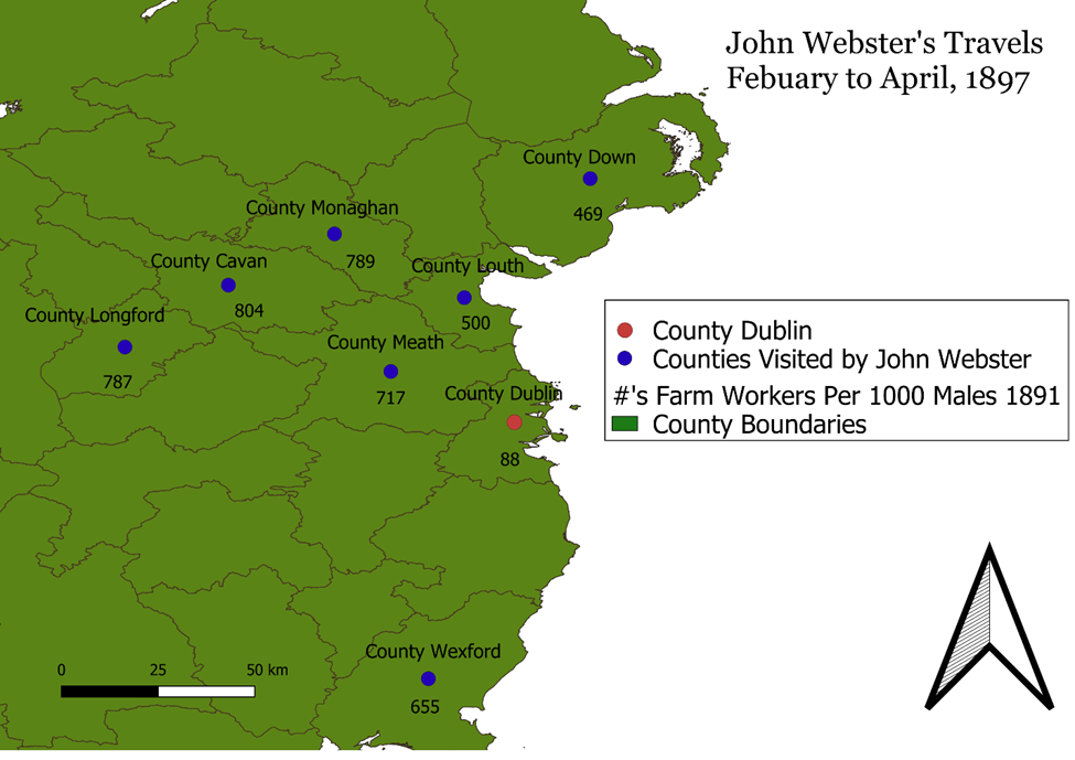
To return to programming after this experience then was not exactly something I was looking forward to then. What had changed this time was the context in which it was presented. Rather than being shown as an end unto itself to accomplish vague tasks it was concretely linked to something that mattered to me the practice of history. This presentation moved away from the more theoretical tasks I had encountered in my high school class to something that could genuinely help my work. I put much of this down to the programming historian tutorials, which while in depth and technical at points, never lost sight of how coding as a tool could help a historian. For example, the idea of using code to scrap html for text was fascinating, and something that not only employed historical examples in the tutorial, but also had a clear application within a historical setting.

Scraping the HTML of the Old Bailey for Text

This is not to say that even these relatively clear tutorials had no issues, as everyone with little coding experience in the class encountered a plethora of errors from the major to the minor. This however is to be expected when learning anything for the first time, and overall, it seems we made a decent amount of progress overall.

Some Errors Along the Way

Despite this progress most of the benefits of coding still seem a long way off from where my skills are now. I would be incredibly hesitant to attempt even simple code within projects contained by the timeframes of university undergrad courses. This is not to say that I didn’t get anything out of the course. Where I found it most useful was in illustrating what kinds of things are possible with code for history. In particular the automation of repetitive tasks on badly designed websites, which I believe at some point or another we have all come across. In addition, I think most importantly it gave me a better chance of conveying my needs of code to someone who has the actual skills to put code together to do a specific task.

The Most Complicated Code I got to Work in the Tutorials

I truly believe that coding will only grow in importance as a tool for the historian as more and more text is available in improved OCR. What I think the biggest hurdle this task will face however is in its potential users and in user experience. History generally speaking attracts those that are interested in the humanities and while there is some cross over in interest in other subjects, I think this will be a difficult group to get to buy into the value of coding as a historical tool. Much of this however I believe could be countered with a more simplified user experience from coding languages and systems. While I understand that python is supposed to be one of the easier languages to learn it continues to be far less user friendly than any of the other tools we have explored in this course. If this were to change I believe that buy in would be much higher, but seeing as humanities users make up a relatively tiny slice of their consumer base I doubt that private industry has the desire to pursue this at this point in time.

Blog Post 3 Encounters With HGIS

HGIS is a tool that I had absolutely no experience with at the beginning of my degree, yet now it has begun to take up my attention in greater and greater amounts. I first encountered HGIS in the third year of my degree, walking in bright eyed and innocent, to History 311: Mapping History taught by professor Benjamin Hoy. He was the first to introduce me not only to the concept of GIS, but also what practical abilities it held for the aspiring historian. From theory to tools this class set out an entirely new method of conducting history, and presenting information. Through the labs and tutorials of the 311 class I gained a set of skills that not in my wildest dreams had I imagined gaining in a university history class from the stylistic design of maps, to file management, and basic Excel skills.

The First Map I Ever Made on My Own In QGIS

This was also my first encounter with the issues and bugs that plague QGIS. These issues range from the relatively minor, like unintuitive user interface, to the incredibly painful like the having your work entirely lost or corrupted. These issues in addition to a fairly sharp learning curve while figuring out button placement, how to import data correctly, and how to save your work so it won’t be lost or erased I know from experience can make learning GIS a daunting task. By the end of the course however, my skills had improved significantly, being able to create a map that not only looked fairly attractive in my opinion, but actively helped to make a historical argument based on historical data that I had collected. This is where HGIS really came into its own for me, as you are able to take complex or large amounts of data and present it in such a way that the viewer can understand your point quickly and with minimal aid from text.

One of The Maps I Made for My Final HIST 311 Paper

This past summer I got to take this further designing maps for professor Jim Handy as part of his upcoming book. These maps introduced me to new tools still and further improved upon the skills I already had. It was during these maps that I was introduced to the power of open-source tutorials and instructional videos related to QGIS which allowed me to incorporate things like elevation into my maps. These videos as long as they are up to date with the version of QGIS in use, unlike texts or written instructions allow you to see each step in real time significantly reducing the learning curve on everything from fundamental to complex functions. While far from perfect these serve as a free resource that can greatly increase and expand your abilities in GIS. These maps for professor Jim Handy also introduced me to the “joy” of working in grayscale, with this limitation of publishing forcing creative use of symbology and labels.

A later Draft of a Map of a Map Made for Professor Jim Handy

On march 3rd I worked with ArcGIS for the first time, and was generally unimpressed. There were some improvements that I noticed immediately, namely the undo button, and an improved interface for working with attribute tables,. While I will acknowledge that my experience was probably shaped by both my experience with QGIS and the computers we were using ArcGIS on, I saw nothing that to me justified the huge cost, other than the fact that it is the industry standard program.

Although at times frustrating, and unforgiving then I believe that HGIS stands as one of the lowest investment, highest yield skills a historian can learn. While it initially can be hard and feel like you are just copying tutorials it quickly opens up and allows you to augment your work in ways that require little effort and help to illustrate your points clearly. This is not to say it is universally useful to every historical project, especially in those in which hard geographic data is less common. HGIS lends itself significantly more to more modern subjects, and takes on an increasingly important role in those subjects that deal with a large scale, or lots of data. The maps you can produce with even a rudimentary knowledge of a free program like QGIS present a new world of possibility for both historical argumentation, and presentation to both a public and academic audience.

Blog Post 2: Video Games as Public History

Introduction 

The year is 1940 and the situation is desperate for the Canadians. Fascist British troops under the leadership of Oswald Mosley swarm out of Labrador and seize ports and railroad hubs as they push towards the industrial heartland of central Canada. Although allied with a number of other Communist powers like Mexico through the Mutual Aid Bloc their assistance may be too slow in arriving as the newly renewed imperial efforts of the British Empire smash the ill-equipped forces of a Canada that had been focused on building up industrial power in the prairies.  This was one of my most recent experiences in the Hearts of Iron Four (HOI4). Created by Paradox Interactive a Swedish based video game company and released initially in 2016 HOI4 is a grand strategy video game that places the player in control of a nation in the period leading up to, during, and immediately following the Second World War.

Political and military map screen at the start of a game as Canada in Hearts of Iron Four

While it is possible to play a historically accurate game, as can be assumed from my experience above, the player is always free to change the course of history for their own nation and with a push of a button can randomize the path of the AI nations. This can create numerous alternate history and bizarre turns of fate where things like a now Fascist Australia joining the Axis, and the Soviet Union restoring the Czar can take place.

The historical focus button which can radically alter a game of Hearts of Iron Four

These decisions are enacted through a focus tree, a series of decisions that benefits the player and allows them to chart a course for their nation. Canada gained its own unique focus tree in the DLC “Together for Victory” and as such presents an interesting ability to examine how Canadian history, and alternate Canadian history is presented in a public setting.

Canada in Hearts of Iron Four

The player of Canada is introduced to a number of things immediately by opening the country panel Mackenzie King is Prime Minister, and through the political pie chart that democracy is by far the dominant ideology, but not the only one.

Canada country screen at start of game

The player then has the option of appointing a number of different advisors all offering different abilities and based on different historical figures.

Canada advisors panel

The player is also introduced to the concept of Canada as a dominion and faced with two modifier spirits, The Great Depression and Conscription Crisis Among French Canadians. By hovering over these spirits, the player gains small descriptions of each and is presented with two key gameplay challenges. The Great Depression severely limits their ability to up industrial production, and Conscription Crisis severely limits their recruitable population for military efforts.

Canada’s starting national spirits

This one panel introduces a player to not only the political leader of the period, but also two key issues tied to the Second World War. This is where the strength of HOI4 as a piece of public history lies, by facing a player with historical issues it allows them to engage not only with how they will choose to work around them, but what they will enact to fix them. This is then further built upon in the focus tree, where players are given a number of different branching decisions and the ability to prioritise them. These decisions generally, except in the case of some of the ahistorical ones, are based on real historical events or ideas.

Canada focus tree

For example, the first focus a Canadian player can take if they want to begin addressing the Great Depression is called the Rowell-Sirois Commission.  Based on the real-life commission of the same name this focus introduces and gives a small summary of the commission stating “The Rowell-Sirois Commission has determined that Canada’s federal constitutional arrangement hinders recovery from the Great Depression. We should equalize the standards of service nationwide.” Although this also serves a gameplay purpose by providing political power this then introduces the player to a fairly obscure, but relatively important part of Canadian history.

The economic side of the Canadian focus tree
Rowell–Sirois Commission focus

While the introduction of historical events and decisions holds obvious value to introducing the public to history, I would argue some of the ahistorical events also hold value. This is accomplished by introducing minority movements like the Canadian Fascist and Communist movements and eventually their leaders if you pursue focus paths that switch your ideology. Through this players are not railroaded to remain historical while still engaging with historical aspects.

Conclusion

Where HOI4 fails as a work of public history however is in the absence of many of the less military or economic focused aspects of the war, notably the Holocaust. By doing this HOI4 removes much of the darker side of many of the political movements and governments it presents creating a risk of sanitizing things like Nazism into just another political ideology. While useful then in presenting a player with some introductory historical knowledge in a manner that takes advantage of play it by no means offers a deeper historical learning and may in fact create a false historical narrative by exclusion.

Digital Academic History Project Review : Gossamer Network

Gossamer Network is a digital history project created by Cameron Blevins, Yan Wu, and Steven Braun. Gossamer Network is intended to act as a companion piece to Cameron Blevins’ academic book Paper Trails: The US Post and the Making of the American West. The website acts to visualize the incredible amount of data that is behind and explain through written portions, the argument that Cameron Blevins is making. This argument being that the key institution in securing western American expansion was the U.S. Post Office. Blevins, who wrote the content of Gossamer Network, is a Professor of U.S. History and Digital Humanities at the University of Colorado Denver whose research has focused on western American history, with a significant portion of his work also exploring the use of digital tools in both historical and text-based projects such as his work with the diary of midwife Martha Ballard.  According to the about page Gossamer Network itself had website work done by Yan Wu a graphics and data reporter, with additional design by Steven Geofrey Braum a data visualization and information design assistant professor who is currently teaching at Northeastern University.

Example of typical Gossamer Network presentation

Gossamer Network works well within a desktop environment, barring some occasionally awkward loading and better than initially expected within a mobile environment, when used in landscape mode. The basic use of the website involves scrolling down which presents the audience with both new text and often new visualizations. These visualizations can be hovered over and clicked on for more information, to change the visual or to highlight a portion of the current visual. The website is divided into 9 sections that can be switched between using a bar at the top of the screen that follows the audience. Each section excluding the introduction is divided into a period of time and arranged in chronological order.

Gossamer Network Section Bar

When read in order Gossamer Network acts like a traditional academic article in many ways utilizing prose with conventional citations. Where the real difference comes is in the visuals utilized alongside this argument.  By placing Gossamer network within a digital environment Blevins doesn’t have to be restricted by the limitations of physical publication of maps. This allows the reader to both see the massive and detailed data related to Blevins’ argument and interact with it in a way that is impossible to accomplish with physical maps.

For example, the second block of text in the first section titled “1848-1853: Forays” contains prose that outlines the traditional notion of western settlement in the United States. The prose then challenges this as ignoring the fact that the United States didn’t really control this land, but rather Indigenous populations did. The audience can then mouse over sections with different Indigenous groups names within the text to see their associated territory on the map and to see the limited number of post offices within the West at this point in time. By showing the Indigenous control of land in contrast to the number of post offices it shows the limits of American government control in a clear and concise way that through interaction engages the audience. In addition, the audience member can hover over the map directly to see what territory is associated with what group including those outside of the scope of the attached text. This ability to go beyond what is discussed in the text is only increased in further visuals, which allow interaction with other elements. For example, other sections provide the ability to click on every post office mapped to find the name, location and operational years.

Second Block of Text in the First Section of Gossamer Network
Example of Gossamer Network Interaction

What makes this interactivity and use of visuals all that more astounding is the massive data sets that back it up, with three data sets from US Post Offices, Atlas of Historical County Boundaries, and Invasion of America  integrated into this one source. The only real criticism I have would be of some of the language used in Gossamer Network which occasionally uses the more outmoded term, at least in the Canadian context, native in place of Indigenous.

Gossamer Network then is perhaps one of the best examples of what working within a digital environment academically can look like. Not only is Blevins’ data on a scale that would have been unfeasible before the introduction of digital tools, but it is presented in a way that would have been impossible outside of a digital environment. For me then this project is both an exciting look at what can be done with digital tools and techniques, but also raises some interesting questions as to how the academic field might have to adjust from a solely print model to a hybrid model to be able to recognize and incorporate this scholarship done in a digital environment.