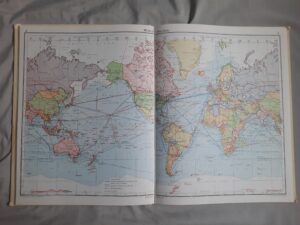
I have always been a lover of maps and cartography, ever since I was a child I was entranced by how someone could possibly create maps that were both practical and beautiful. When I learned that I could mix my world of studying history, with my love of staring at maps, I immediately jumped at the chance to make my own maps.
I am still relatively new to the world of Historical Geographic Information Systems, having explicitly been introduced to digital history last semester in History 311: Mapping History. Mapping History has been one of my favourite classes I’ve taken so far, while also being the most challenging and difficult course by far. I like to think I have a love/hate relationship with mapping and HGIS, once you learn it is almost addictive and I find myself thinking of how to apply it in other papers and assignments, even though I know the pain it is sure to cause me.
The most difficult part of mapping in my opinion was not the mapping programs themselves, it was the securing and understanding of usable and useful data. Throughout the course I had switched my topic about once a week, as I had grand ideas of the project I wanted to pursue, but either the data that I needed did not exist or would become too time-consuming to create my own dataset out of. Trying to remain within the small frame of skill set and time was a difficult task. Some sites that I used for locating data sets were IPUMS, Canadian GIS, and the infamous dragons8mycat.com (which I could no longer locate when researching for this post). The data sets on these websites are open source, meaning they are free to download and use.
The website that I ended up settling on for GIS data was from Building Borders. The project is a collaboration between many different scholars, including Dr. Benjamin Hoy. Of all the GIS websites, Building Borders was the easiest to understand and locate data within, which could be due to the specific focus on transnational and border history in Canada and the United States. My favourite feature was the inclusion of interactive maps, that showed what the downloadable data sets are supposed to look like when loaded into mapping programs. Having the reference of what the files were supposed to look saved me time with second-guessing to go straight into fixing the problems (which there were many)
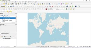
The course taught QGIS, and for an open-source, free program it does the job as best as it can, despite its layout that is reminiscent of the classic Microsoft Paint I used in grade school, it does the same job as the paid program ArcGIS. although Arc in generally considered the better of the two. After using both programs, I have to agree. The layout in Arc felt more intuitive and I think this is due to how similar it is to the current layout of Microsoft Word. Both are equally prone to crashing and issues unique to each program. Both programs have tutorials to teach you how to navigate and create maps. Sites like The Programming Historian, and The Geospatial Historian have tutorials to learn mapping on each program.

HGIS can be incredibly frustrating to learn, the best advice I have when attempting to learn mapping programs is to not be afraid to ask for help, ask friends or colleagues for help, or even search forums because I can assure you that you are not the only person struggling. The best way I can describe my encounters with HGIS is an adventure, but I know without the guidance I received I wouldn’t be able to create maps at all.