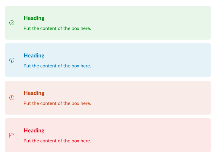
One of the frustrating things about building pages in Canvas is the lack of functionality in the RCE (Rich Content Editor) to add “callout boxes” or other elements that separate blocks of text/media content in a simple and visually-appealing way. However, this is actually a fairly easy thing to add with some editing of the HTML. This post will show you how to add alert boxes and provide you with some code snippets to borrow for your own course.
When Might Alert Boxes be Useful?
The alert boxes I am sharing here are designed with 4 “flavours” which speak to their functionality, and are similar to approaches used by web designers in lots of different online contexts:
-
- Success – green in colour; show the learner they have completed something or confirm they are ready to move onto the next step.
- Info – blue in colour; provide the learner with additional information or with a just-in-time reminder or hint.
- Warning – orange in colour; provide the learner with a note to be careful or pay special attention to something.
- Danger – red in colour; the most serious or stern note of caution to learners, when they really need to watch out for something that might cause them frustration or confusion.
Especially when used consistently across a course, alert boxes are a good way to cue learners to each of these types of messages and apply some Chunking (an important cognitive strategy, especially for online learning) to your materials in Canvas.

Adding Alert Boxes to Canvas Pages
The steps to editing HTML in Canvas are outlined here: How do I use the HTML view in the Rich Content Editor as an instructor?
Copy and paste the following code snippets into the Canvas HTML editor, making sure to replace the text portions (the parts that say “Heading” and “Put the context of the box here“) with the message you wish to communicate to your learners.
Success:
<div class="alert alert-success" style="margin: 0px 0px 12px;" role="alert">
    <table>
        <tbody>
            <tr>
                <td style="border-right: 1.5px dotted #0d8a13; padding-right: 15px;"><i class="icon-complete"></i></td>
                <td style="padding-left: 15px;">
                    <h3 style="text-align: left;"><span style="font-size: 14pt;"><strong>Heading</strong></span></h3>
                    <p style="margin-top: 0px;">Put the content of the box here.</p>
                </td>
            </tr>
        </tbody>
    </table>
</div>
Info:
<div class="alert alert-info" style="margin: 0px 0px 12px;" role="alert">
    <table>
        <tbody>
            <tr>
                <td style="border-right: 1.5px dotted #0078bd; padding-right: 15px;"><i class="icon-info"></i></td>
                <td style="padding-left: 15px;">
                    <h3 style="text-align: left;"><span style="font-size: 14pt;"><strong>Heading</strong></span></h3>
                    <p style="margin-top: 0px;">Put the content of the box here.</p>
                </td>
            </tr>
        </tbody>
    </table>
</div>
Warning:
<div class="alert alert-warning" style="margin: 0px 0px 12px;" role="alert">
    <table>
        <tbody>
            <tr>
                <td style="border-right: 1.5px dotted #c5451e; padding-right: 15px;"><i class="icon-warning"></i></td>
                <td style="padding-left: 15px;">
                    <h3 style="text-align: left;"><span style="font-size: 14pt;"><strong>Heading</strong></span></h3>
                    <p style="margin-top: 0px;">Put the content of the box here.</p>
                </td>
            </tr>
        </tbody>
    </table>
</div>
Danger:
<div class="alert alert-danger" style="margin: 0px 0px 12px;" role="alert">
    <table>
        <tbody>
            <tr>
                <td style="border-right: 1.5px dotted #e11e2b; padding-right: 15px;"><i class="icon-flag"></i></td>
                <td style="padding-left: 15px;">
                    <h3 style="text-align: left;"><span style="font-size: 14pt;"><strong>Heading</strong></span></h3>
                    <p style="margin-top: 0px;">Put the content of the box here.</p>
                </td>
            </tr>
        </tbody>
    </table>
</div>
More HTML Options
See more HTML tricks and code snippets that you might borrow by browsing through the modules area of the GMCTL Canvas Samples & Resources.
More text box options are on this page: “Callout” Boxes.
If you like these alert boxes but want to use another icon to better match your message, see more options on this page: HTML Icons.
Photo by monicore from Pexels.com.


