
Markets are always adjusting to ensure quantity clears. And there are many things that can happen to make a market change! Sometimes the price changes, causing a movement along the supply or demand curve, and sometimes the whole curve will shift. A change in price will cause a movement along a curve, which is known as an endogenous change. One way to think of it is that “endo” means “within” and you can see “price” within the graph.
Changes that cause the demand and supply curves to shift are called exogenous, where “exo” means out: thus they would be any changes that occur that cannot be seen as part of the graphs. This will become clearer as we go through some examples.
Let’s look first at the different types of factors that affect the consumer, and thus the demand curve. You will likely relate to many of them because you are a consumer. Let’s first look at preferences. We all buy goods and services that we like, and we don’t all like the same thing. We will start with a great agricultural product that comes from barley and hops.
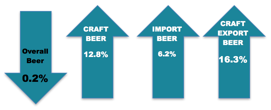
Figure 6-7: US BEER SALES VOLUME GROWTH Statistics from the Brewers Association. Permission: Courtesy of course author Hayley Hesseln, Department of Agriculture and Resource Economics, University of Saskatchewan.
The image above tells us that the demand for beer increased in 2015 as indicated by higher sales. This is especially true for “craft beer,” which is made in small batches by independent brewers (as opposed to big brewers like Labatt’s, Molson’s and Great Western in Canada, or Budweiser and Miller in the US for example).
So what could account for this? Tastes or preferences are changing and more people are turning to small batch runs to slake their thirst. Let’s take a look at what we can expect in the market with a generic market graphic.
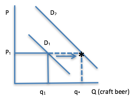
Figure 6-8: Initial shift in quantity given shift in Demand. Permission: Courtesy of course author Hayley Hesseln, Department of Agriculture and Resource Economics, University of Saskatchewan.
Figure 6-8 shows the demand for craft beer to be D1, with a price of P1 and quantity demand of q1. The statistics from the Brewers Association tell us that the demand has increased (we could be precise my modelling the exact figures if we wanted to). Here’s where we will employ ceteris paribus by looking only at one change at a time. The first thing that happens is an increase in demand: meaning a shift in demand from D1 to D2. At the price P1, we will see an increase in quantity demanded initially to q* that coincides with the new demand curve (this is shown by the asterisk on the dashed line at the intersection of price and D2). We are missing the other part of the market – supply. Let’s add that in Figure 6-9 as the red line (S) and see what happens next.

Figure 6-9: Market adjustment to new equilibrium, e*. Permission: Courtesy of course author Hayley Hesseln, Department of Agriculture and Resource Economics, University of Saskatchewan.
At the asterisk, you’ll see that the demand is at q* as read from the new demand curve, but the price still reflects supply at q1. That means demand is greater than supply and there will added pressure to increases prices to make the market efficient. As the price rises, fewer people will be willing to pay and the quantity demanded falls. At the same time, brewers will increase the quantity they produce (note: not the supply), to meet demand. Eventually, the new market equilibrium occurs at e*.
While the mechanism is a little tedious to go through, you need to see it to gain an appreciation of market forces and how prices change to clear the market. In the beer example, there was:
- An exogenous shock to the demand for beer – preferences changed – causing Demand to shift. You’ll note that in the market graphs, you do not see preferences mapped anywhere – preferences are external to this picture.
- A short-term difference between quantity demanded and quantity supplied put pressure on prices upward.
- As prices moved upward (endogenous to the supply curve), there was a movement along the supply curve to arrive at the new equilibrium, e*.
- The end result is a higher price (P2), and a higher quantity demanded (q2).
Note there was no change in supply, only the quantity supplied as a result of the price change. What we generally see is the movement from the first equilibrium to the second without an appreciation for why the market adjusts.
Let's take a look at another change that affects consumers. Remember Adam, Bob and Carl… how about if we add Debbie, Earl, Fran, ..., Susan, Tommy, etc.? The more people in the market, the greater the demand. When we expand the size of the market by adding consumers, we show this by shifting the demand to the right. Alternatively, if we prevent consumers from purchasing goods and services in our markets, we would see a shift in the demand to the left (a contraction in demand).
Can you recall from Module 1 that trade makes people better off? Why so? One reason is that we can expand our markets for goods and services. Trade effectively increases the number of people in the market. When our politicians argue for free trade, they are trying to expand markets. When producers attempt to make trade deals with other countries or regions, they are trying to expand their customer base. Here’s why.
“According to Lesotho’s National AGOA Strategy, the country’s annual garment exports to the US increased from about $129 million in 2001 to $330 million in 2015, representing 80 per cent of total external demand for the country’s textiles and garments.” Mupotola 2016
If we were to graph the market for textiles in Lesotho, Africa, we could show an increase in demand as a result of successful export strategies. The garment industry was able to increase demand in the US, thus leading to an increase in price and an increase in quantity sold. The graph would look just like the one in Figure 6-9.
Test yourself to see if you can tell the story that matches the changes in the textile market.
What other factors are you influenced by as a consumer? We’ve talked about taste, and the number of people in the market. What about income? How much money you have will definitely influence your purchases. This is true for individuals as well as the larger population.
If you’ve been following the news, you’ll know that China’s wealth is growing. People are becoming more affluent as the country experiences tremendous economic growth. When people have more money, they not only buy more of the same thing, but they can afford more expensive products. Many people change their food purchasing habits from cheaper vegetable and cereal’s based diets to diets reliant on more animal protein. This is an important change in terms of Canadian agriculture because it means that an increase in Chinese per capita income will result in higher demand (a shift in the demand curve) for various Canadian agricultural products.
The effect in the market is an increase in demand, followed by price adjustments resulting in higher quantity demanded/supplied, and a higher price. This is in the short run.

Figure 6-10: Chinese affluence will increase demand. Source: https://www.weforum.org/agenda/2016/01/3-great-forces-changing-chinas-consumer-market/. Permission: This material has been reproduced in accordance with the University of Saskatchewan interpretation of Sec.30.04 of the Copyright Act.
“There are several reasons to be bullish on Chinese consumption, which we project will grow 9% annually through 2020. One is that incomes are rising. Per capita income in China has been increasing at an 11% annual pace since 2010.”
Kuo 2016
Do you like hamburgers? Do you get a million fliers in your mailbox with coupons trying to entice you to buy Big Macs, Whoppers, and Teen Burgers? Three of the biggest fast food restaurants in Canada are McDonald’s, Burger King, and A&W. We all know about these giant hamburger joints, but they are marketing because they want to increase demand for their products (the sole purpose of marketing). The three goods I’ve identified are all burgers and for the most part, they are relatively similar (although I'm sure some would disagree). In fact, we could say they were substitutes.
Other products on the market will affect the demand for goods and services. The closer their characteristics, the more likely they are to be perfect substitutes where you can’t much tell the difference between the two: Aquafina water and Fiji water, Tim Horton’s doughnuts and Robin’s doughnuts. Dare I say, “John Deere and Case?”
Substitutes are goods that replace each other. That means when the price of one changes, the demand for the other changes. For example, if the price of a Whopper drops (say you have a coupon), the demand for Big Macs will drop. You will substitute away from eating at McDonald’s in favour of eating at Burger King. Let’s take a look at this graphically.
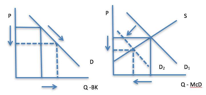
Figure 6-11: The effect of a change in price in BK market, causing a change in demand in McD market. Permission: Courtesy of course author Hayley Hesseln, Department of Agriculture and Resource Economics, University of Saskatchewan.
Let’s deconstruct the changes step by step.
- Prices fall for Whoppers from Burger King (first market panel). The change shows a decrease in price, and an increase in quantity demanded. (Remember that price change is endogenous.)
- Because prices are lower for Whoppers and quantity demanded goes up, more consumers are drawn to Burger King, and away from McDonald’s even though there is no change in price of the Big Mac. We show this by a decrease in demand (shift of the curve).
- The end result is a decrease in the price of Big Macs and a decrease in quantity demanded for Big Macs.
Provide your example of substitute goods.
Just as we have goods that replace each other, we have goods that go together. We could revisit our beer example and consider hops and barley. We could also think about tractors and trailers, trucks and tires, sprayers and chemicals, bread and ovens, and on an on. These goods are called complements, and they too affect how consumers behave and therefore, demand rather than supply. If the price of a good goes up, the demand for its complement will decrease and vice versa. Let’s look at Energy.
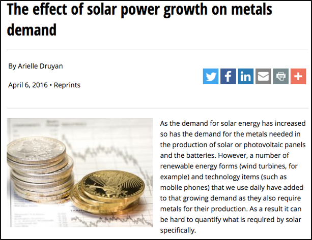
Figure 6-12: Complementary relationship between solar power and the demand for metals. Permission: This material has been reproduced in accordance with the University of Saskatchewan interpretation of Sec.30.04 of the Copyright Act.
There’s been much ado about generating renewable energy through wind and solar power. The article on solar power and metals in the side box shows the complementary relationship between the two.
As price of solar power becomes more competitive, the demand for metals that are used in the panels increases (although the article points out that metal is also need for other renewable energy sources making it difficult to attribute metal demand only to solar). Nonetheless, the relationship is complementary, meaning that as the price of one decreases (solar power), the demand for the other will increases.
Let’s take a look at the graphs for this relationship. They are much the same as substitutes in that there are two markets/two panels.
The first panel in Figure 6-13 shows the decrease in price of solar power (likely as a result of better technology), which makes it more competitive and more likely to be adopted (remember, lower prices are incentives for us to increase quantity demanded).
The second panel shows the market for metals. You will see that a drop in price of solar power, results in a shift in the demand for metals. The drop in the price of one good causes the demand for its complement to increase. If the price of solar power had gone up, we would see a decrease in demand (the entire curve) for metals.
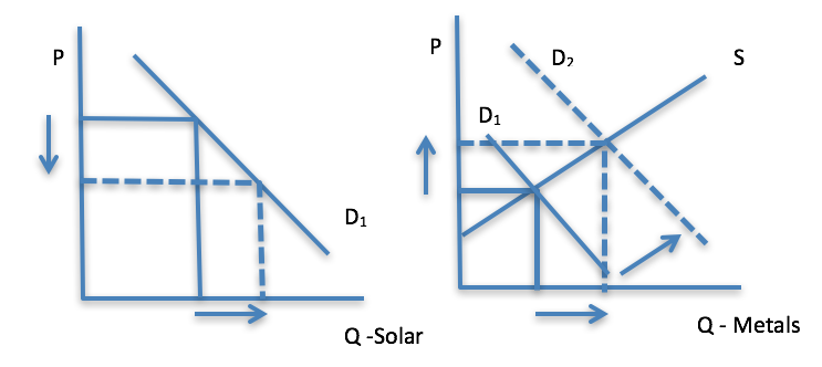
Figure 6-13: Complementary markets solar power and metals. Permission: Courtesy of course author Hayley Hesseln, Department of Agriculture and Resource Economics, University of Saskatchewan.
Let’s outline the changes step-by-step:
- The price of solar power drops likely as a result of better technology causing an increase in quantity demanded for solar power.
- Because metal goes into making solar power generators, and the price of metal hasn’t changed, we see an increase in the demand for metals as evidenced by a shift from D1 to D2 in the second panel.
- The increase in demand results in a price increase, which stimulates movement along the metal supply curve (endogenous change) to arrive at a new equilibrium with a higher price and higher metals quantity demanded (as seen on the x-axis).
A quick summary tells us that exogenous changes that affect demand are income, the number of consumers in the market, preferences or tastes, and substitutes and complements. All these factors will influence consumers, which means we will see a change in demand rather than supply. The scenarios above are all taken from current events to show you that what we are studying is real and relevant. While you don’t have to sit down and draw demand curves, learning to identify market dynamics will help you to predict changes in markets about prices and available quantity.