
Over the last two modules, you learned that physical production of products is dependent on the types of inputs used, how they are combined, the effects of innovation and technology on production, and of course, economic factors such as how variable and fixed costs can affect profitability. All of these factors, combined with price, will determine whether a producer is profitable.
Let’s think of production in the real world. Think of all the farms including small family farms, heritage farms, and corporate farms: they all produce products (grains, pulses, fruits, vegetables, and even trees) that are will be sold in a market. Similarly for businesses producing different foods, bio-products, clothing, meat and dairy, fertilizer, herbicides, etc. We learned that each producer must make decisions regarding production that takes into consideration costs and how to combine inputs. We will now take a broader look to see what supply looks like, knowing that the supply in the market is a collection of all individual producers, the same way that demand is a collection of individual consumers.
Let’s start with individual producers. You are in the deli business and you and your competitors all make sausage. You each face slightly different costs because you have different sized delis, different equipment (in terms of size, age and quality), you have different recipes, and you have different labour requirements given family obligations and other employees in your deli. If we consider just this small group of three as the “market” we would see that each producer has different production incentives. Table 6-2 shows how three different producers would respond to increasing market prices. The relationship between quantity supplied and price is the opposite of that for demand in that it is positive, or direct, meaning that as price increases, so too does quantity supplied. The reverse is also true.
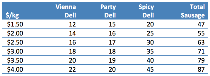
Table 6-2: Sausage production - three delis. Permission: Courtesy of course author Hayley Hesseln, Department of Agriculture and Resource Economics, University of Saskatchewan.
Let’s also assume that the market price is fixed: that each person cannot influence the market price because they are only one of many suppliers. Looking at Figure 6-2, we see that market prices are shown from $0.00 to $6.00 per kg on the vertical axes (in this case the price per kg of sausage). Quantity supplied is indicated on the horizontal axis and is measured in the number of kg of sausage produced. When we graph this relationship we get the supply curve for each individual. Each supplier will stuff a different amount of sausage given the price, however, as price rises, each producer responds positively to the increased price incentive by producing more output.
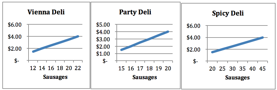
Figure 6-3: Individual supply curves for three ranches. Permission: Courtesy of course author Hayley Hesseln, Department of Agriculture and Resource Economics, University of Saskatchewan.
This result should not be surprising given that as price rises, the sausage makers can sell their links for more money per kg. You should note that not all deli owners produce the same amount. For example, at $2/kg, the Vienna Deli will offer 14 kg, the Party Deli will offer 16 kg, and the Spicy Deli will offer 25 kg. When the price hits $4/kg, Vienna offers 22 kg, Party offers 20 kg, and Spicy offers 45 kg. The theory of supply suggests that an increase in price will lead to an increase in the quantity supplied. In general, as prices rise, suppliers have an incentive to make more thus creating movement along the supply curve.
Next, if we wanted to look at the market we would add the total quantity offered at each price. For example, at $2/kg we would add the total offered by Vienna (14), Party (16) and Spicy (25) to get the total in the market (55) – the last column in Table 2. You could also do this for the other prices to get the total market supply at each price.
What would the market quantity be at $4/kg?
Figure 6-4 shows the market for sausages, which is the sum of all sausages offered at each price. You’ll notice that the total market supply curve is located further to the right on the graph, thus reflecting the higher number of sausages available at all prices.
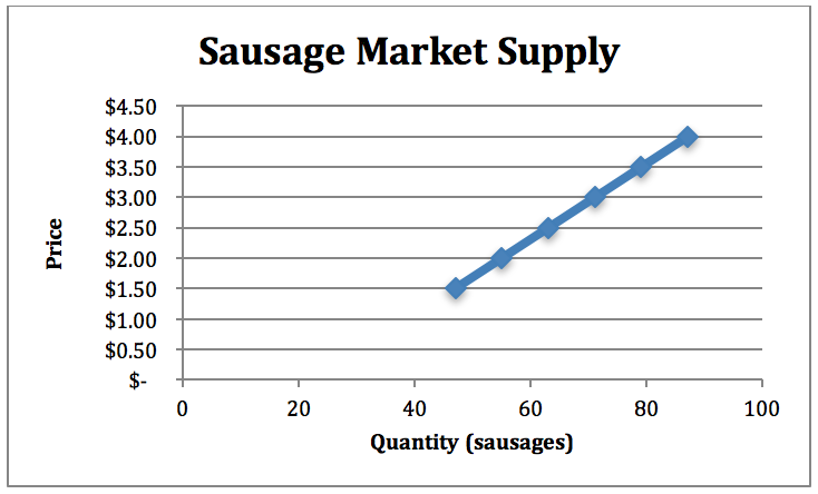
Figure 6-4: Market supply for sausages. Permission: Courtesy of course author Hayley Hesseln, Department of Agriculture and Resource Economics, University of Saskatchewan.